
About the badge
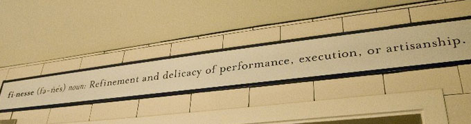
 In a small town in Northern California called Yountville, above the door leaving the one of the world’s most celebrated kitchens, is a ceramic tile with the word “Finesse” accompanied by its definition. I know this because each year I have a thank you lunch for the students in my lab. They get to select the restaurant and we usually end up at the French Laundry (always ask for a tour of the kitchen, it is amazing). Mr. Keller signs his books with the inscription, “It’s all about the finesse“. That has been my mantra as organizing chairman of Medicine 2.o @ Stanford. This was an artisan conference, handcrafted with love. So, I’m going to tell you the story about how we made the Medicine 2.0 @ Stanford conference badges.
Conference Badges Pretty Much Suck
I attend a lot of conferences. And the one thing that I thought would be the easiest to improve at the Medicine 2.0 @ Stanford conference was the badge.
Let’s be honest, conference badges pretty much suck. I think if they had a conference for conference badge makers the badges would probably still suck. There are so many reasons: 1) they are usually too small, so you have to squint to read the person’s name, 2) when they do print the name, you have to first figure out the person’s first name because that’s how we usually greet someone, 3) when they are on a lanyard they also tend to flip around so many times you can’t see the front of the badge at all, 4) they also don’t really serve any other function, except to show that you paid for your registration and to identify you to other people, and 5) finally, badges are something we have to carry with us the entire conference so why not make it more useful?
Size Matters
My first decision was that the badge had to be big. Not 2X4 inches, not 3X5 inches, but 4X6 inches big. I tested all sorts of sizes and 4X6 is probably the biggest you can get without feeling clunky or cumbersome. The orientation is important too. Landscape mode flaps around too much and has a lot of wasted space, except for people with really, really long last names. Portrait mode was definitely the winner! Less flapping around and twisting on the lanyard and a joy to read and scan quickly when you meet someone.
![]()
Style Matters
To make the first name really stand out, I chose a font that had lots of variation in its weights. The font I chose can be stick thin or super thick. Perfect for distinguishing first and last names! Color also helps highlight key information, such as the Twitter ID of the user and Sponsor information (thank you Stanford Anesthesia and Stanford Hospital and Clinics!).
Function Matters
Somewhere along the way, I thought: “Why can’t the badge also be the program schedule?” I usually lose the conference schedule after the first day of a conference, but I’ve never lost my badge! After careful thought, I decided to make the badge a book, with all this wonderful information sandwiched inside!
Some engineering notes. In order to open the book, the lanyard has to be connected to the corner. This means the badge has to hang at a diagonal. Also, paper is important. Thin paper tears with repeated opening and thick paper is too heavy and uncomfortable to hang around the neck. So I experimented, spoke with my printer and we came up with a solution: vinyl (I know, not a natural fiber, but it is recyclable)! Thin, lightweight, but incredibly strong. It worked great!
My eureka moment was to print the inside of the badge upside down. Once I stuck on a lanyard and put it around my neck, it made complete sense. Then you can read the program while it is still attached to your neck. Sorry to anyone with presbyopia! But I solved that problem too. The badge lanyard has a breakaway in the back making it super easy to detach from your neck if needed.
Interactivity Matters
The final piece of the puzzle was engineering interactivity. I had the idea of using QR codes for a long time because they are so handy to scan. I thought it might be a much faster way to collect contacts in social situations. The trouble with QR codes is that they are tricky to produce because they aren’t yet widely implemented in a large-scale customized manner. The process is far from automated – each one was generated by hand and inserted into each badge design. Also, information density is important. I made several badges and field tested them in different lighting conditions at actual conference events. I quickly learned that a URL shortener was necessary to reduce the information density for successful QR scans.
Demonstration of the Badge by Warren Wiechmann
Thanks Warren for taking the time to post this video about the badge on YouTube.
Putting it all Together
After six months of research and development, the design was finalized. I put the design away again until we needed to start generating badges for the conference. The workflow we established for generating the badges looked like this:
- Download registrant data into an excel spreadsheet;
- Choose a unique index variable (like registration ID number);
- Download or somehow obtain the delegate’s photo, crop it to a fixed square dimension and name it registrationID.psd;
- Manually obtain a QR code for the delegate’s social networking profile through various known methods (Google it);
- Data merge the photo and QR code into your layout using the unique index variable to link the images;
- Hand-edit each badge to correct for merging errors (long last names need to have font size reduced, accents on names need to be corrected, etc.);
- Find a very good printer willing to experiment and work with you to custom-create each badge from your digital files (factor in at least a month of proofing and experimentation);
- Voila! Beautiful, functional, interactive conference badge!
The hardest part was engineering the design and workflow. Now that it is all established, Medicine X for next year should be a piece of cake!
An artisan badge for an artisan conference. The badge alone is why Medicine X will never be a large conference. I could never create the experience I want for a large group. Yes, the artisan loaf of bread costs a bit more, but it is so much better for you than the mass-produced chemical-laden wonderbreads of the world!

-
[…] the real novelty was in the form of the conference badge, which featured a QR code that fellow attendees could scan and use to link to each other. It is […]
Leave a Comment

Wow Larry, nice badge! Well thought out.
Larry,
I just had a Friend over for dinner and told her all about #med2 and showed her my badge.
I get 100% Geek status for even sharing this information. I have hooks on my wall in my kitchen for backpacks, purses, lunch boxes., etc.
One hook is now dedicated to my @stanford #med2 Gear: Laptop bag, Water bottle, @stanford ID tag and my Badge!
As I speaker I’ve had lots of Badges but never one with such Function & Design.
Thank you,
Lisa
P.S. Glad Medicine X will never get too large~we have enough Wonderbread!